Linecept
UX research and evaluation of a human-centric software prototype
October 2019 - December 2019
Linecept is a collaboration and productivity tool that aims to optimize the software development lifecycle. I was part of a research team that was tasked with conducting a UX study on the software. Our findings informed a re-design of the most problematic pain points.
Contributions
Primary Role
UX Researcher & Developer
Responsibilities
- Designed the survey and interview protocol
- Analyzed collected data to discover user needs
- Created sketches and generated ideas to solve the identified problems
- Created paper prototypes
- Designed high-fidelity mockups in Adobe XD
- Conducted heuristic evaluation

Case Study
Background & motivation
Linecept is a collaboration and productivity tool that aims to optimize the software development lifecycle. Linecept proposed the concept of utilizing an elastic zoomable user interface (EZUI) designed and prototyped by David Kutas, a Ph.D. student at UCI. Since the fundamental premise of the software relied on a novel UI approach, having a clear and intuitive interface was essential. I was part of the research team that was tasked with conducting a UX study on the software.
Given a 10-week timeframe, we utilized a human-centered design approach and implemented a mixed method usability study to identify pain-points and user needs. We recruited participants and conducted usability tests, allowing enough time to compile data, analyze and ideate on findings. Our results informed the redesign of the most problematic parts of the UI. We then conducted a heuristic evaluation and interviewed students who participated in the study to assess the new UI.
Collaborators
David Kutas
Ph.D. student and researcher at UCI
Alissa Powers
M.S. student and researcher at UCI

Formative component
We conducted a survey study with novice users and collected clickstream data from a working prototype. With both closed- and open-ended questions, the survey focused on the students’ understanding of the software, their attitudes, and the difficulties they encountered. 23% of the 257 surveyed users responded to our questionnaire. We analyzed the quantitative answers statistically and organized free responses in an affinity diagram to identify key problems.
Survey Findings
- One main goal of Linecept was to encourage uploading different types of content produced during the project lifecycle at the time of creation. We learned, however; that adding and editing new items was not intuitive, and users struggled with understanding the relationship between content and timelines.
- Most of the confusion originated from the arrangement and labeling of UI components. Creating new timelines and adding items to it were cluttered on the screen under tabs and failed to represent an intuitive sequence of steps. It remained unclear for the user that timelines can hold multiple content types and they often created a new timeline for every added item.
- Terminology was inconsistent when compared to similar project management tools, which made it hard to rely on existing knowledge while learning how to use the application and further obscured conceptual clarity.

Design solutions
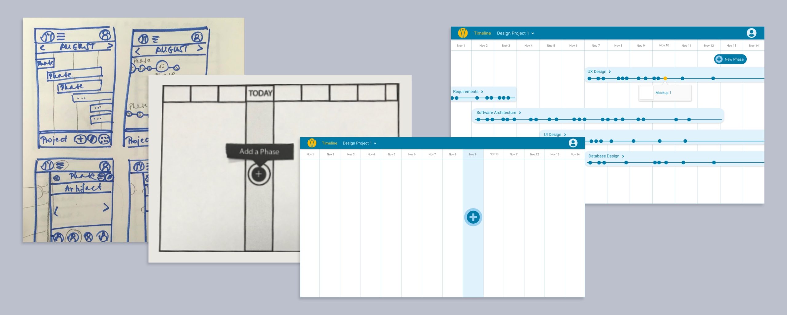
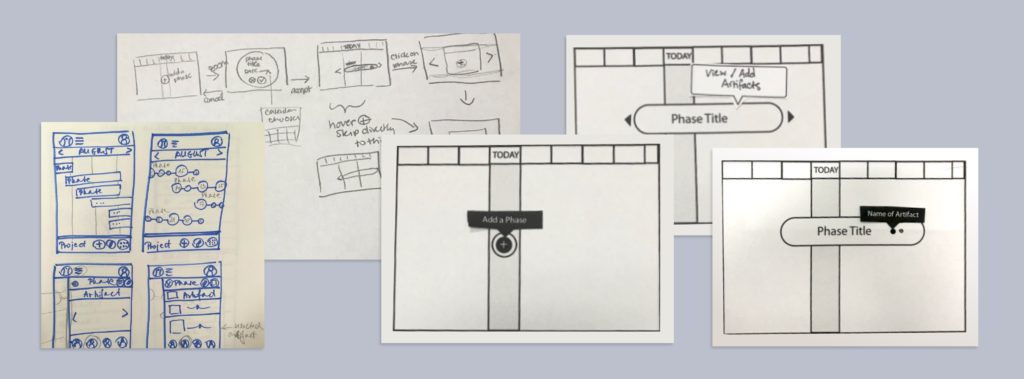
Based on our findings we redesigned the prototype with an intuitive UI and predictable UX with clear representation of the functionalities and how they connect. Focusing on the most problematic pain points, we created designs with varying fidelity to iterate quickly. This included hand drawn sketches to generate new ideas. Then utilizing Figma to draw low-level wireframes of chosen concepts for a paper prototype.
We tested the prototype with 3 unbiased students with no previous experience with Linecept. We used the think aloud method and asked them to complete a task while voicing their thoughts. A researcher played the part of the computer and took notes.
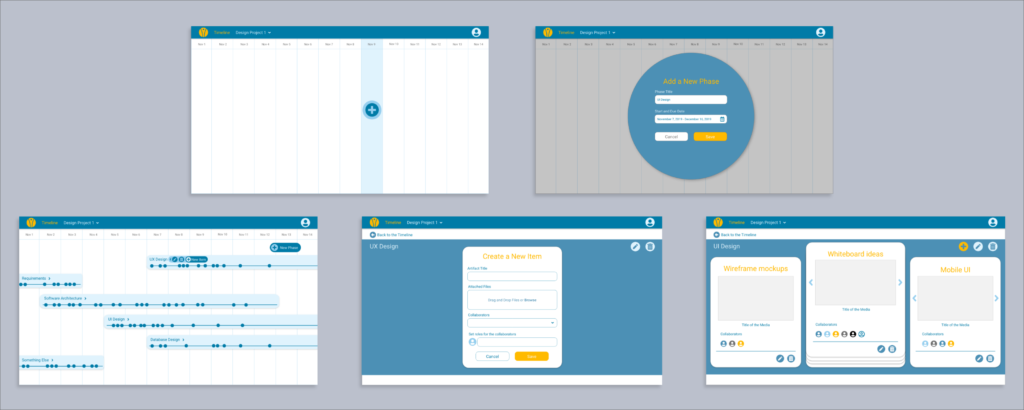
Informed by the results of the paper prototype test, I designed a high-fidelity interactive prototype in Adobe XD, focusing on screens related to the initial usability issues.

Think aloud findings
- Screens displaying an empty white board were not perceived as possible forms of interactions. Students were looking for explicit and more conventional forms of interactive elements. Attainable actions should be reasonably obvious without much hovering.
- Phase bubble on the timeline was not perceived as a button but as a drag and drop element that could be moved to different time slots and stretched to different intervals.
- Navigation between areas needed to be more intuitive. Users expected each screen to contain a shortcut back to the main desktop area.
Heuristic evaluation
To conclude the project, I conducted a heuristic evaluation with Ph.D. students and faculty members experienced in HCI. After analyzing the findings, I wrote a final paper and a presentation outlining the end-to-end project.
In addition to UX research, I participated in the early development of the application. I built out parts of the navigation, authentication, and API using the following technologies: Mongo DB, NodeJS, React, and JavaScript.
